The customizer is the visual editor of a theme. It shows your store as a live preview with your real products and content. You change it by clicking on the page. Everything you do is saved to the theme's draft. Customers see it only after you publish.
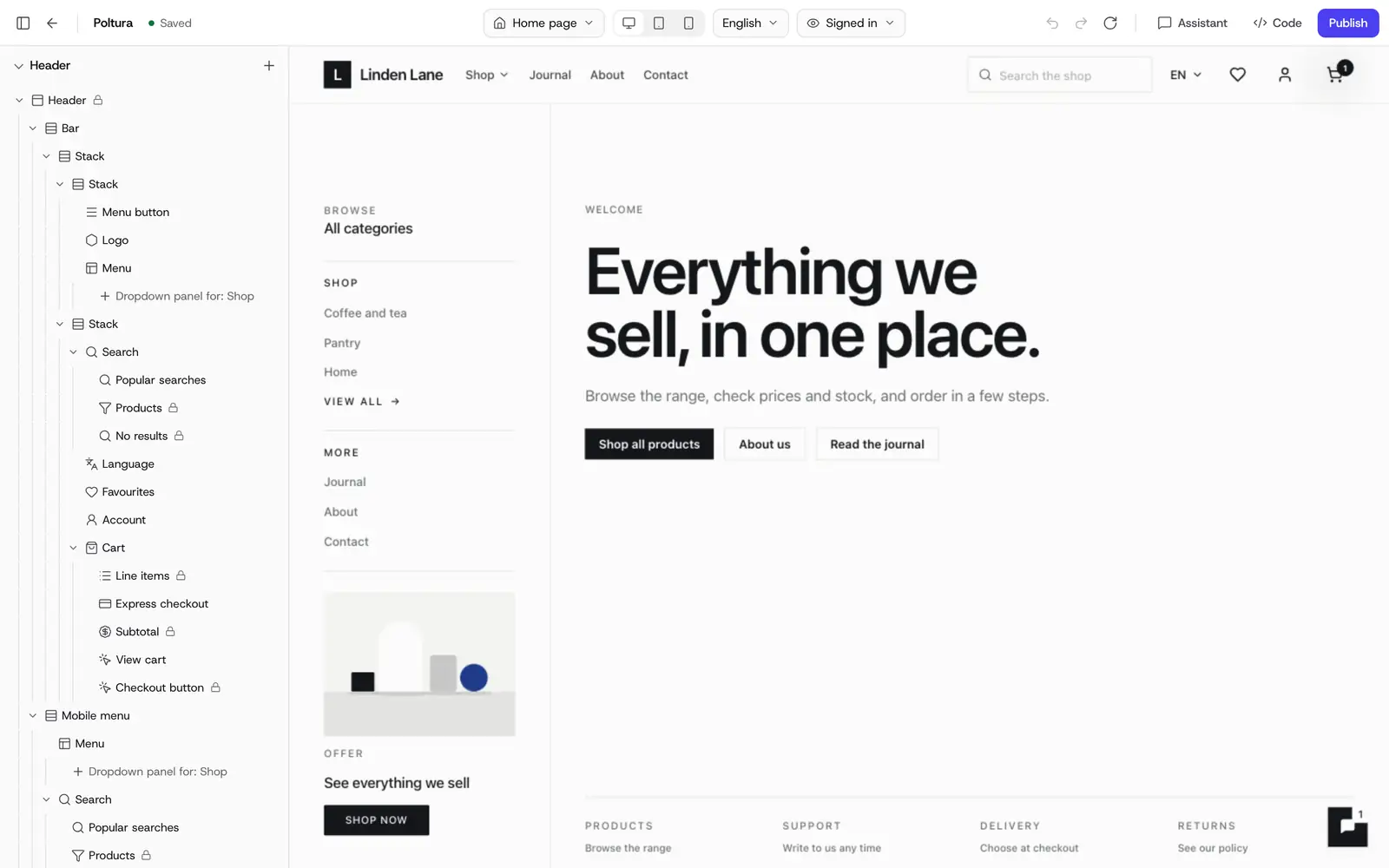
Open the customizer and find your way around
Open Online store, choose Themes and choose Customize on a theme's row.
- The preview in the middle is your store. Click any section or element to select it.
- The sidebar on the left lists the structure: Header, the sections of the page you are on, Footer, Banners, Share images, Emails, Theme settings and Pages.
- The panel on the right shows the settings of whatever you selected.
- The top bar holds the page menu, the device switch (Desktop, Tablet (768 px), Mobile (390 px)), the language, Preview as, undo and redo, the Assistant, Code and Publish. Exit takes you back to the theme.
The save state next to the theme's name reads Saved, Saving…, Unsaved changes or Not saved. A Draft chip means this theme is not the live one yet.
Move between pages
Open the page menu in the top bar to pick any page: shop pages, account pages, content pages, your own pages and menu panels. You can search it or type a path. On the preview, hold Ctrl (Cmd on a Mac) and click a link to follow it.
Preview as switches between a Guest and a Signed-in customer, so you can check what each one sees.
Add and arrange sections
Pages are built from sections stacked on top of each other.
Go to the page you want to change.
Choose Add section in the sidebar.
Pick a section from the gallery. You can search it or filter by category.
Choose Insert. The section appears on the page and its settings open on the right.
Fill in the content. Drag the section in the sidebar to move it, or use Move up and Move down.
From a section's menu you can Hide, Duplicate or remove it. Templates such as the product page, cart or a blog post keep one core section that cannot be removed. So the page never loses its essential content.
The Header group holds the Promo bar and the header. The Footer group holds the footer, the Cookie bar and the Chat widget. See Theme settings and Cookie consent.
Build with elements
The elements editor is in Beta. Elements are the smaller pieces inside a section: headings, text, buttons, images, columns, product cards and more.
Select a section or an element on the page.
Open Add and stay on the Elements tab.
Drag an element onto the page, or click it to insert it next to your selection.
Click the element and edit it on the right.
Elements come in groups: Layout (Container, Columns, Spacer, Divider), Basic (Heading, Text, Button, Icon, List), Media (Image, Video), Interactive (Tabs, Accordion) and Commerce (Product card, Product grid, Price, Add to cart, Collection list, Countdown).
When you want a free-form area, add a Custom section and choose a starting layout, for example 2 columns, Image + text, FAQ or Hero banner. Everything stays editable afterwards.
Change the content and the style
The panel on the right has three tabs for an element:
- Content: the text, image, link and other settings of the element. Texts can also be edited right on the page.
- Style: layout, spacing, size, typography, color, background, border, effects, position and motion. Use the device switch at the top of the tab to style tablet and mobile separately. Desktop styles apply to every device until you change them there. The Normal and Hover switch styles how the element looks under the pointer.
- Advanced: who sees the element and when, described below.
Link fields let you pick a page, product, collection, category, form or web address instead of typing a URL. A button can also Open form in a Popup or a Right side panel. See Forms.
Show an element only to some shoppers, or only for a while
Display conditions are in Beta.
Select the element and open the Advanced tab.
Under Show to, choose Everyone, Guests or Signed in.
To schedule it, set Show from and Show until. Times are in your store's time zone.
The preview marks an element that is waiting for its start time with Hidden now: scheduled.
On the same tab, Anchor ID gives the element an address on the page, so a link to #your-id scrolls to it. Copy link copies that link.
Save a section or block to reuse it
Saved blocks are in Beta.
Select the section or element.
Open More actions on its toolbar and choose Save as preset.
Give it a Name and choose Save.
Next time you add something, find it under Saved.
A saved item keeps its text, translations and style. Deleting it from Saved does not change the pages that already use it.
Add a banner or popup
Banners are bars, popups, slide-in cards and full-page covers that sit on top of your store. A theme can hold up to 20.
Open Banners in the sidebar and choose Add banner.
Under Start from a template, pick one: Announcement bar, Age verification, Newsletter popup, Discount popup, Slide-in promo, Maintenance page, Coming soon page or Blank banner.
Write the text and set the buttons, image and colors.
On the Behavior tab, choose when it appears (On page load, After a delay, After scrolling or On exit intent), how often, and whether visitors can close it.
On the Display rules tab, choose the pages, devices, visitors and an optional schedule.
Switch Enabled on. The banner goes live with your next publish.
The preview always shows the selected banner. The display rules apply on the live store. When two banners compete for the same spot, the one higher in the list wins.
Change the look in one step
Under Theme settings in the sidebar, Theme styles offers the three ready-made styles of your theme, for example Neutral, Warm and High contrast in Poltura. A style sets the colors, the corner radius and, in most themes, the fonts. Your content and sections stay as they are. The other groups under Theme settings are described on the Theme settings page.
Translate while you edit
The customizer edits one language at a time. Choose the language in the top bar. Layout, colors, links and media are shared by every language, and only the text differs. Each text shows whether it is Translated, Machine translated, not translated or outdated.
You can translate a single field, Translate this element, Translate this section, Translate this page, or everything that is missing in a language. Machine translation uses AI credits.
Undo, history and the assistant
- Undo and Redo are in the top bar. Show history lists every step with who made it (You, Assistant or Elsewhere), and you can jump back to any of them.
Ctrl+K(Cmd+Kon a Mac) opens the command bar. Type to find a section, a page, a device, a style or a setting, or to ask the assistant.- The Assistant button opens Klea beside the preview. It knows which page and element you are on, and each of its edits is a step you can undo. Ask AI on an element's toolbar offers rewrites of a text. The assistant in the customizer is in Beta. See Klea, the assistant.
Publish
Check the page on Desktop, Tablet and Mobile.
Choose Publish in the top bar.
The button reads Published, and a notice lists what went live.
If the theme was not the live one, publishing makes it live. See Themes.
Good to know
- A page can hold up to 40 sections and 1,000 elements. Elements can be nested 5 levels deep, with up to 24 items in one container.
- A content page can keep the shared page layout or get its own. Choose Customize this page only to give it its own layout, and Reset to shared layout to go back.
- The pages visitors see while the store is closed (Coming soon, Maintenance, Payment needed) are under Store access pages in the page menu. When they show is decided in Store status.
- If someone else edits the same theme, or the code editor saves a change, it arrives in your customizer live. Edits to different settings are merged.
If something goes wrong
- "Autosave failed" or the state reads Not saved. Click the save state to try again. Your edits are still in the editor.
- "The theme's code has an error, so the preview shows its last working version." Your live store is unchanged. The fix is in the theme's code: open the code editor with Code.
- "Publish failed". The new version could not be prepared. Your live store is unchanged. Try again. If the notice mentions the theme's code, fix it in the code editor first.
- Nothing can be added here. That part of the page has a fixed layout. Select another section or element.