Theme settings apply to the whole store, not to one page. They cover the theme's style, your logo and name, colors, fonts, the cookie bar, the chat widget and more. They belong to a theme, so each theme keeps its own.
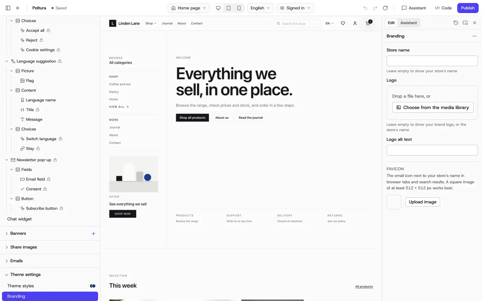
Where to change them
Theme settings are in the customizer, under Theme settings in the sidebar. You see every change on the live preview. The change goes into the theme's draft, and customers see it after you publish.
Open Online store and choose Themes.
Choose Customize on the theme's row.
Open Theme settings in the sidebar and choose a group, for example Colors.
Change the values on the right and watch the preview.
Choose Publish when you are done.
What the groups cover
The groups vary a little from theme to theme, and a few have their own names, such as Masthead instead of Branding in Editorial. Every shipped theme has these:
- Theme styles: the theme's three ready-made styles, described below.
- Branding: store name, logo and its alt text, and the favicon.
- Colors: every color role of the theme. Each color has a Light and a Dark value, because shoppers can switch your store to dark mode in the footer.
- Typography: body font, heading font and corner radius. You can choose Inter, Poppins, Roboto, Open Sans, Lato, Montserrat, Playfair Display, Merriweather or the system fonts.
- Cookie bar: see Cookie consent.
- Chat widget: the look of the chat launcher and panel. It appears only if your plan includes the Inbox.
- Newsletter: whether the signup shows in the footer. See Newsletter.
- Menus: the menus of the header and footer, the same as on the Menus page.
- Copy & locales: the theme's built-in wording, see Storefront wording.
The promo bar and the way the header behaves are set on Header in the sidebar. The colors, font and logo of your emails sit with the emails, in the Emails group of the sidebar. See Emails.
Some themes add settings of their own, for example Layout with the product grid density in Essential, or stock colors in Catalog.
Set the favicon
The favicon is the small icon next to your store's name in browser tabs and search results. It is also used as the icon on phone home screens.
In the customizer, open Theme settings and choose Branding.
Under Favicon, choose Upload image. A square image of at least 512 × 512 px works best. PNG, JPEG, WebP, AVIF and SVG files are accepted.
Drag the image to position it and use Zoom to crop it square.
Choose Apply.
If the icon has transparent parts, pick a Background color. It shows behind the icon where it cannot be transparent, such as on phone home screens.
Check the three previews: browser tab light, browser tab dark and phone home screen.
Publish the theme. The favicon appears on your store after you publish.
Decide how the header behaves
In the customizer, select Header in the sidebar.
- Header on scroll: Always visible, Hides when scrolling down or Scrolls away with the page.
- Shrink when scrolled: the header gets shorter and the logo smaller once the page scrolls.
- Transparent header: Never, Home page only or Every page. The first section shows through the header until the page scrolls.
- Text while transparent: Light, for dark images or Dark, for light images.
Switch to another theme style
Every theme comes with three styles. A style sets the colors, the corner radius and, in most themes, the fonts. Your emails take on its colors too.
- Poltura: Neutral, Warm and High contrast
- Catalog: Clean, Workshop and Graphite
- Editorial: Paper, Ink and Sepia
- Essential: Sage, Clay and Slate
- Launch: Signal, Cobalt and Mono
- Pop: Bright, Mono and Pastel
- Marina: Marina, Harbour and Driftwood
- Rivet: Rivet, Night shift and Blueprint
In the customizer, open Theme settings and choose Theme styles.
Pick a style. It is applied to the draft, and the preview changes at once.
Publish when you like the result, or use Undo to go back.
A style changes only the look settings. Your content, sections and code stay as they are.
Good to know
- Store name, logo alt text and promo text are per language. Colors, fonts, the logo image and links are shared by every language.
- Colors are designed in pairs. If you change a light color, check the dark one too.
- Empty email design fields use the storefront's own values.
If something goes wrong
- "This image is too small." Choose an image that is at least 48 × 48 px. Larger is better.
- "This file can't be read as an image." Use a PNG, JPEG, WebP, AVIF or SVG file.
- The new favicon does not show on the store. Publish the theme first. Browsers also keep old icons for a while, so try a private window.
- A change is not on the store. It is in the draft. Publish the theme.